Charts usually display two axes: one on the bottom and the other on the left side. But what if we have more parameters in the data range and want to incorporate a secondary axis? Yes, it is now also possible to add a secondary axis in the vertical direction in Google Sheets!
To add a secondary axis, you need to first navigate to the “Customize” tab in the “Chart Editor” sidebar. Now, select the “Series” option and define the first series from the drop-down menu that you want to display on your right (secondary axis). Scroll down and select “Right Axis” from the drop-down menu beneath the “Axis” option.
However, it is the easiest way, as there are many ways to incorporate, stylize, and customize the secondary axis in Google Sheets. So, without any further ado, let’s check out how to add the new axis the right way!
- #1. Introduction To Dual Axis Charts In Google Sheets
- #2. Creating A Basic Chart In Google Sheets
- #3. Adding A Secondary Axis In Google Sheets
- Customizing The Secondary X Axis
- Working With Google Sheets Combo Chart Secondary Axis
- Common Issues And Solutions When Working With Dual-Axis Charts
- Conclusion | Recap of Key Points
#1. Introduction To Dual Axis Charts In Google Sheets
Charts are the key representation of any complex data for a better understanding of the audience. Most people prefer charts and graphs over mechanical and boring numbers in any spreadsheet.
Data visualization is also needed when you work with so much data that it is impossible to correlate in your mind. And in those cases, we need to incorporate a chart and, possibly, a dual-axis chart!
Definition And Importance Of Dual Axis Charts
A dual-axis chart is nothing but a simple chart (of any type) with two Y axis. While the first axis will show up on the left side of the chart, the second one will appear on the right side of it.
So, you’ll get three labels (one on the X-axis and two on the Y-axis) in a dual-axis chart rather than a simple chart having just two levels. And these dual Y-axis charts can be a savior if you want to represent data that correlates with the X-axis.
There are many benefits of using a dual-axis chart. Some of those benefits are as follows.
- A dual-axis chart is ideal for representing a trend of data over time.
- It is also great for representing two separate but correlating data in the same chart.
- You can easily monitor even the smallest changes in data with dual-axis representation.
- It is the only way to display two data columns simultaneously on the same chart.
It is better to filter the data and make it clean and organized before you proceed with any chart in GS or MS Excel. To know more about it, follow my latest guide on filtering data in Google Sheets.
Scenarios For Using Dual-Axis Charts
The use cases of dual-axis charts are immense. You can technically incorporate a secondary axis whenever you want to represent two data at the same axis.
Let’s say you have data that shows both the sales and return on any given month. So, if you display the month on the X (horizontal) axis, you can only include either sales or return in a simple chart of any type.
However, with the dual-axis chart, you can represent sales on the first Y axis and the return on the second Y axis. And both the sales and returns will start to show up in correlation with the X-axis (month).
This is a simple use case that I’m talking about! However, you can use a dual-axis chart for any complex data. It is also an excellent tool if you have an inventory to maintain where you need to represent both sales and purchases over time.
#2. Creating A Basic Chart In Google Sheets
To add a secondary axis, you need to first make a simple chart in Google Sheets with the two axes (which is by default). And once the basic chart is made, you can then add another axis on the same start.
Creating a basic chart in Google Sheets is really easy and takes just a few seconds. Here are the steps.
- Step 1: Launch Google Sheets on your system and open your spreadsheet.
- Step 2: Click on the first cell of the range of data that you want to use in the chart.
- Step 3: Click and hold the blue square button at the bottom-right corner of the cell.
- Step 4: Now, drag it diagonally to select the entire data range that you want to work with.
- Step 5: Navigate to the main header menu and click on the “Insert” option.
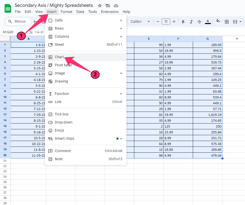
- Step 6: Click on the “Chart” option, and a “Chart Editor” sidebar auto automatically loads on the right side of your spreadsheet.
- Step 7: Navigate to the “Chart Type” option and select the type of chart you want to incorporate from the drop-down menu.
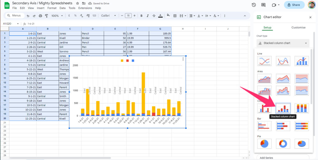
- Step 8: Finally, click on the drop-down menu below the “Stacking” option and choose your preference.
- Step 9: Once done, you can now see a new chart is being displayed on your spreadsheet.
If you want to make a clean and easily understandable chart, you need to filter your data first and remove all the duplicates from it. Check out my detailed guide on removing duplicates in Google Sheets to know more.
#3. Adding A Secondary Axis In Google Sheets
Once you are done making the basic chart with the selected data range in your spreadsheet, you are now ready to incorporate another Y-axis on the same chart.
Kindly note that you can add a secondary axis to any type of chart in Google Sheets, let it be a line chart, a column chart, or a pie chart. However, you need to take cautious steps before adding multiple axes to a complex pie or doughnut chart.
Understanding The Need For A Secondary Axis
If you want to display multiple data series to represent your overall data, you previously need to add two or more charts. But with the secondary axis, you can now display multiple data series on the same chart.
It is also a great feature if you want to track the time-wise change of two correlating data series. The X-axis will then show the timeframe where two Y axis can represent two separate data ranges.
Let’s say you have both income and expenditure in a spreadsheet where it changes each month. With the primary Y axis, you can display your income. And with the secondary Y axis, you can display your expenses.
Here, the X axis will represent time, and both the Y axis (earning and expense) will display two separate data ranges.
Step-By-Step Guide To Adding A Secondary Y-Axis
I’ve already shown you how to make a simple chart in Google Sheets, as it is needed before incorporating another Y-axis in the same chart.
Here, the steps will start from the chart editor (the sidebar that loads while you make a simple chart). Steps are easy, though!
- Step 1: Navigate to the “Chart Editor” sidebar located on the right side of your spreadsheet and click on it.
- Step 2: Click on the “Customize” tab from the header selection menu.
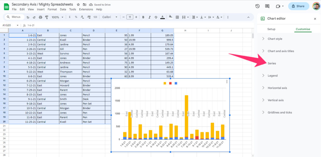
- Step 3: Click on the drop-down menu beneath the “Series” option.
- Step 4: Now, select the series that you want to add as a secondary axis.
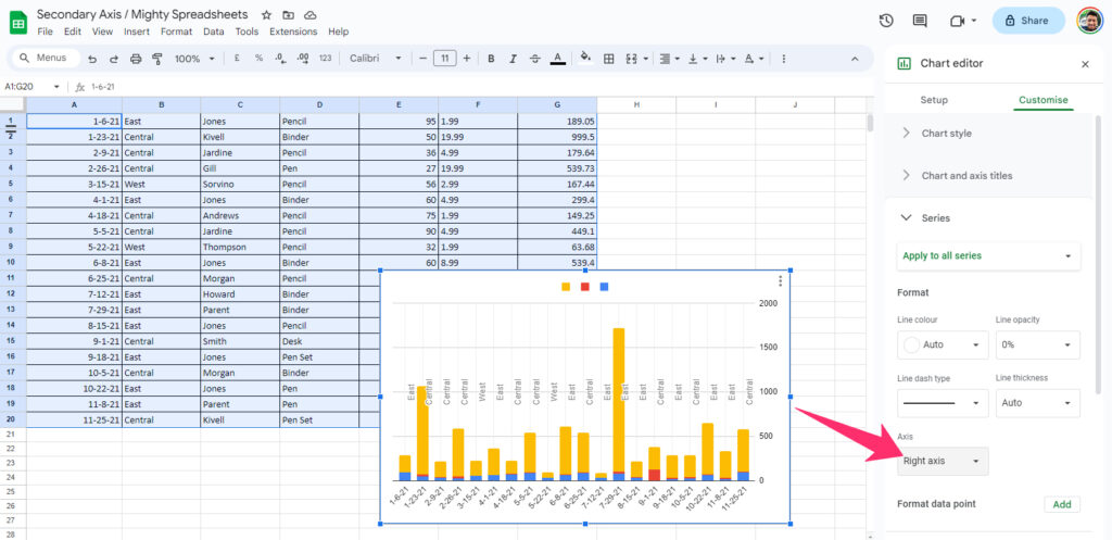
- Step 5: Click on the drop-down menu beneath the “Axis” option.
- Step 6: Select “Right Axis” from the options.
- Step 7: Finally, define a text color for the secondary axis, and it will start displaying on the right side of your chart.
Bonus: You can’t make a neatly organized chart without properly labeling the legends. And do the right way, follow my latest guide on labeling legends in Google Sheets.
Customizing The Secondary X Axis
Google Sheets offers a lot of customization options after the recent updates. You can now even insert emojis and special symbols directly into your spreadsheet.
It also gives you several customization options for any type of chart. If you have added another Y axis in your chart, you can still customize the secondary axis as well.
Customizing Dual Axis Charts In Google Sheets
You can do many things to customize both the axis of your chart. Even if you are using a secondary Y axis in your chart, you can still do it. So, let’s see how we can stylize the axis.
Adjusting The Horizontal Axes
When you create a new chart, a single horizontal and vertical axis will appear by default. And you can start your customization from the horizontal axis. There are many customization options available which you can do in a few simple steps.
- Step 1: Click on the name of the legend under the “Charta and Axis Titles.”
- Step 2: You can see the “Horizontal Axis Title” is now automatically selected on the sidebar.
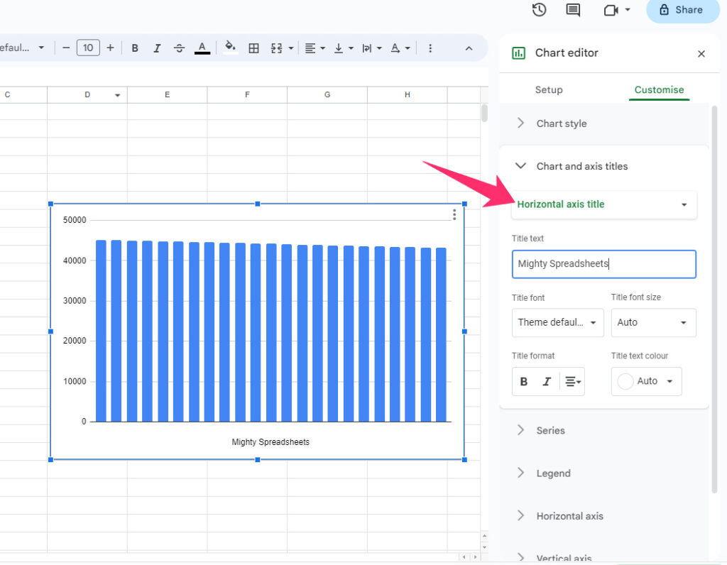
- Step 3: Enter any name that you want to display in the horizontal axis in the “Title Text” box.
- Step 4: Select your preferred font from the “Title Font” option.
- Step 5: Now, select the size in the “Title Font Size” option (The default is “Auto”).
- Step 6: Choose if you want to make it bold or italics from the “Title Format” option.
- Step 7: Finally, define the color from the “Title Text Color” drop-down menu.
- Step 8: You can then click on the horizontal labels and repeat the same process to customize those as well.
You can also choose the “Reverse Axis Order” after selecting the horizontal legends. It will then start your data on the chart from right to left instead of left to right (which is by default).
Adjusting The Vertical Axis
Once you are done with the horizontal X-axis adjustment, you can now proceed with the vertical axis adjustment in Google Sheets. If you are using a secondary one in the Y axis, you can customize both the axis as well.
- Step 1: Double-click on the chart, and the “Chart Editor” sidebar will load.
- Step 2: Click on the “Setup” option from the header tab.
- Step 3: Click on the drop-down menu beneath the “Stacking” option and select if you want to stack both axes together.
- Step 4: Now, navigate to the “Series” option and choose if you want to add or remove any series from the horizontal axis.
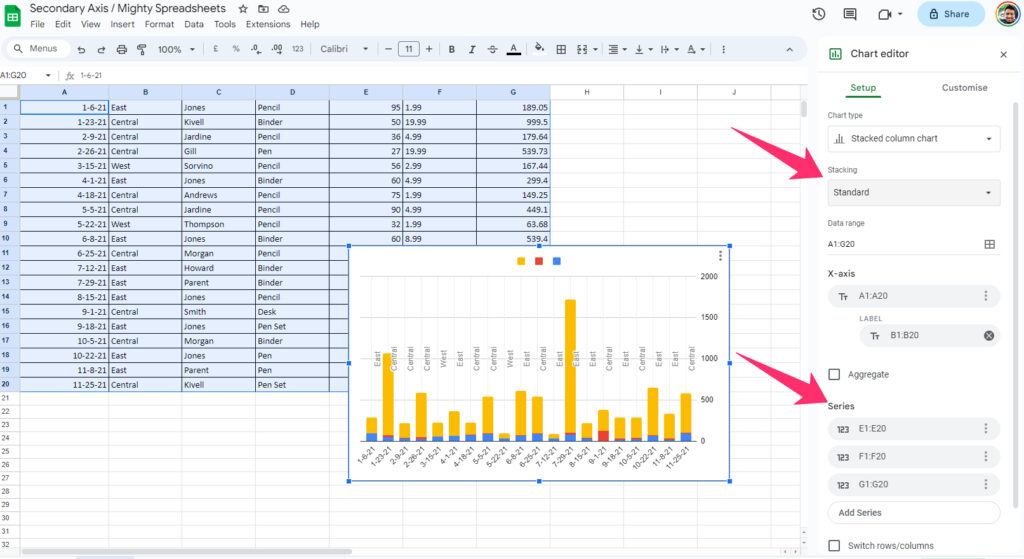
- Step 5: Once done, navigate to the “Customize” tab from the header menu.
- Step 6: Click on the “Series” option.
- Step 7: Now, click on the first drop-down menu and select the series that you want to display on the left side of your Y-axis.
- Step 8: Format the series and the legend as I’ve described in the vertical axis customization.
- Step 9: Navigate to the “Axis” option and select “Left Axis” from the drop-down menu.
- Step 10: Scroll up and select the second series from the drop-down menu.
- Step 11: Customize the same way that I’ve previously described.
- Step 12: Finally, select the “Right Axis” from the drop-down menu beneath the “Axis” option.
Bonus: Do you know that you can now easily change the row height in your spreadsheet? Check out my comprehensive guide on adjusting row heights in Google Sheets to know more!
Working With Multiple Y Axes
Google Sheets only gives you the option to use two Y axis in a single chart. You can’t incorporate more axis vertically by any means. However, it is possible to define multiple data ranges in a single chart if you are using a pie or a doughnut chart.
So, when you can only define two axes vertically, then it is better to define the most important data range on the left side of the chart and the secondary one on the right side of the chart.
Alternatively, you can also use combo charts to define more data ranges than a column chart or a line chart.
Working With Google Sheets Combo Chart Secondary Axis
As I’ve already said, if you are working with multiple data series and also want to display two vertical axes rather than one, it is better to go with the combo chart rather than the traditional line or column chart.
These combo charts help you to visualize multiple data ranges at the same time in a single chart.
Overview Of Combo Charts
A combo chart is a type of chart that combines two different chart models in a single one. You can either work with a single or a double data set in a combo chart. Right now, the available combinations for combo charts are as follows.
- Two line charts combined into one.
- Two column charts combined into one.
- Combination of a line and a column chart.
You can also use multiple data points in a combo chart to represent separate sets of data on a single chart.
Adding A Secondary Axis To A Combo Chart
Like the column or line chart, you can now also add another secondary Y axis in the combo chart on Google Sheets. And it will represent all the datasets in the given combo format. The steps are easy, though!
- Step 1: Launch Google Sheets and open your spreadsheet.
- Step 2: Select the entire data range that you want to incorporate in your chart.
- Step 3: Now, click on the “Insert” option from the header menu.
- Step 4: Click on the “Chart” option from the menu, and the “Chart Editor” sidebar will load on your right.
- Step 5: Navigate to the “Setup” option from the header tab.
- Step 6: Click on the drop-down menu beneath the “Chart Type” option and select “Combo chart” from the list.
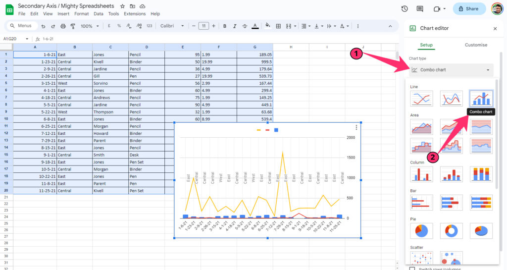
- Step 7: Now, navigate to the “Customize” tab from the header selection tab.
- Step 8: Click on the “Series” option from the list.
- Step 9: On the first drop-down menu, select the series that you want to display on your left.
- Step 10: Scroll down and select “Left Axis” from the drop-down menu beneath the “Axis” option.
- Step 11: Now, scroll up and select the series that you want to display on your right from the first drop-down menu.
- Step 12: Scroll down again and select “Right Axis” from the drop-down menu.
- Step 13: You can now see two vertical axes are now displayed on the combo chart.
- Step 14: To customize further, click on the legends on your horizontal axis and stylize it in the way I’ve already mentioned above.
Bonus: Do you know that you can now directly refer to a cell, tab, or even a separate spreadsheet? To know more, check out my detailed guide on referencing another spreadsheet in Google Sheets.
Common Issues And Solutions When Working With Dual-Axis Charts
Although Google Developers quickly fixes any bug that appears on the Workspace tools like Google Sheets and Google Docs, you can still encounter errors while incorporating a chart in your spreadsheet.
So, let’s see what the issues are that can generally appear and how to solve them properly.
Troubleshooting Common Problems
The first complaint that I mostly get from newbies regarding charts is the chart appearing in the middle of the spreadsheet. However, you can just click on any empty space in the chart, hold it, and drag it to a suitable place where you want to display it.
Another complaint that I get is regarding the incorporation of a separate data range in the same chart. Most people think that we can add only one range to our chart. However, you can use multiple data ranges in the same chart.
- Step 1: Double-click on the blank space of your chart, and the “Chart Editor” side widget will load.
- Step 2: Now, select the “Setup” option from the header selection menu.
- Step 3: Click on the grid icon under the “Data Range” option.
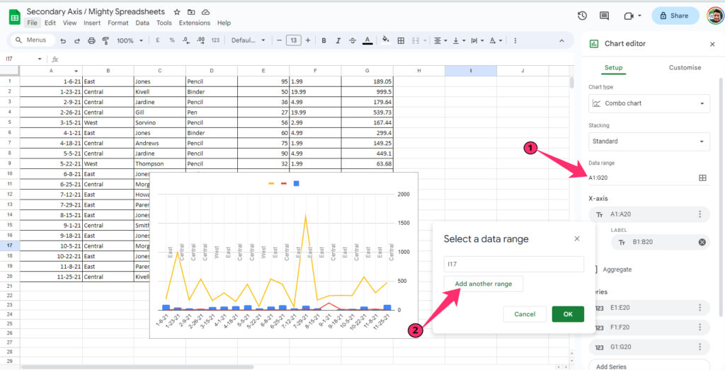
- Step 4: Once you get a popup menu, define the first data range.
- Step 5: Click on the “Add another range” option.
- Step 6: Now, define the next data range that you also want to incorporate in your chart.
- Step 7: Repeat the process if you want to add more data ranges.
If you don’t want to use the first row of your data range as the default headers of your chart, just untick the box beside the “Use Row 1 As Headers” option in the “Chart Editor” sidebar.
And if you don’t want to use the first column of your defined data range as your label, you can just uncheck the box beside the “Use Column A As Labels” option.
Best Practices For Dual-Axis Charts
If you are working with a large or complex data set, you need to sort and filter your data first before you actually make a dual-axis chart. And there are certain tips and tricks that you need to follow.
- Remove all the duplicates from the selected data range.
- Properly organize the data in a single data range to make it easy to work with.
- Don’t try to incorporate more than two axes in the vertical formation.
- Prioritize the axis. Select which series you want to display on the right and left.
- Assign different colors to the series and label legends.
- Keep your chart as simple and clean as possible for better and easier data visualization.
Bonus: Like Google Docs, it is now also possible to insert a page break in Google Sheets as well. Check out my newest guide on inserting page breaks in Google Sheets to know more.
Conclusion | Recap of Key Points
If you are working with three parameters in a defined data range, it is necessary to incorporate a secondary vertical axis on your chart. It will not just make the data visualization a lot easier but will also display the chart in a much more concise manner.
But don’t forget to label the legends the right way. It is better to use different colors for different parameters if you are using a line or a column chart. It is also better to use different colors in the label legends to distinguish different parameters in a single chart.