If you have ever used Google Sheets for data visualization, you must have already realized the importance of different legends in any chart. Without those, you can’t make a chart in a digestible format for common people. But do you know how to label legend in Google Sheets the right way?
You can easily label a legend by clicking on the name of the legend displayed in the chart. It will make the title editable. You can then assign your preferred title for each legend you have on your chart. Besides, you can even customize the font, size, color, and many other things of the legends through the “Chart editor” sidebar.
But before you label legends, you also need to make a streamlined chart to have an optimum output with the legends. So, without any further ado, let’s see how we can make good use of this feature in GS!
Understanding Legends in Google Sheets
Before you know how to label legends in Google Sheets, you need to have an apt understanding of legends to use them for your benefit. And by mastering it, you can also master data visualizations.
What Is A Legend In Google Sheets?
Legends are the names or tags that describe the data in a chart in Google Sheets. There are many types of charts that can be made on GS, and you can use legends in all these chart styles.
It is also an effective tool that can help you to make any complex data easily understandable by visual representation. You can add it to a line chart with a single data series, or you can also add it to bar charts with multiple data series.
Legends are also necessary for the viewers to understand the chart if you are visually presenting the data. Without it, your audience will have difficulty knowing what data series you are using on your chart and which is denoting what.
If you are using lines, colors, and shapes in your data visualization, it is also necessary to assign legends to different labels. Without those, users will not understand the meanings of those different markups.
Bonus: IF is a versatile function that you can use to solve complex problems in Google Sheets. So, check out my detailed guide to know all about the ‘IF” function.
Different Types Of Charts Where You Can Label Legends
Google Sheets is undoubtedly a great spreadsheet tool for data visualization, as many data scientists also use it for optimum output. And this tool gives us the option to design different types of charts with our data range.
There are seven types of core charts available right now on Google Sheets, which are as follows.
- Line Chart
- Area Chart
- Column Chart
- Bar Chart
- Pie Chart
- Scatter Chart
- Map Chart (For demographics)
Besides these seven primary chart styles, you can also use ten other secondary chart styles, including waterfall, histogram, radar, gauge, scorecard, candlestick, organizational, treemap, timeline, and table chart.
How To Add A Legend In Google Sheets?
To add a legend in Google Sheets the right way, you need to first know about the basics of chart making. Once you are familiar with it, you can then easily assign different legends to different data series.
So, let’s start from the basics and learn how to efficiently assign legends in different charts in GS.
How To Create A Chart In Google Sheets?
You must have already known that you can make different types of charts in Google Sheets. However, you can follow the same method to make any kind of chart. And it is easy to do it!
- Step 1: Launch Google Sheets and open your spreadsheet.
- Step 2: Select the data range either by clicking and dragging your mouse or by using the name box.
- Step 3: Click on the “Insert” option from the header menu.
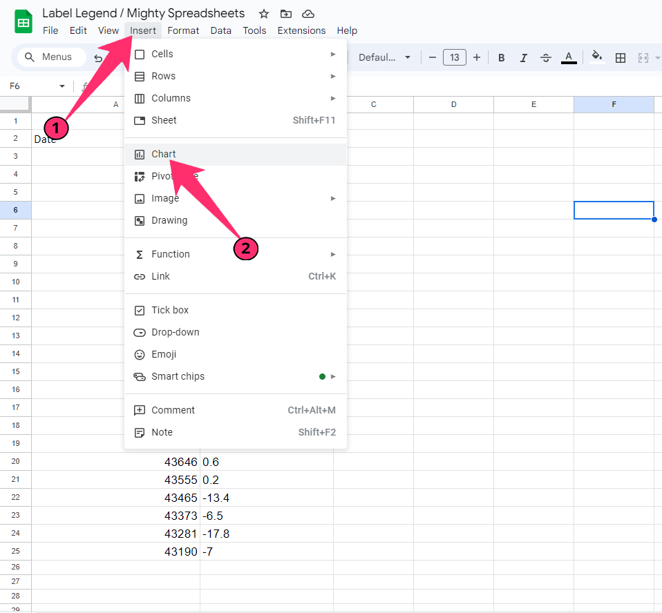
- Step 4: Click on the “Chart” option, and the default chart will appear along with a “Chart editor” sidebar on the right.
- Step 5: Select the type of chart you want to make from the drop-down menu beneath the “Chart type” option.
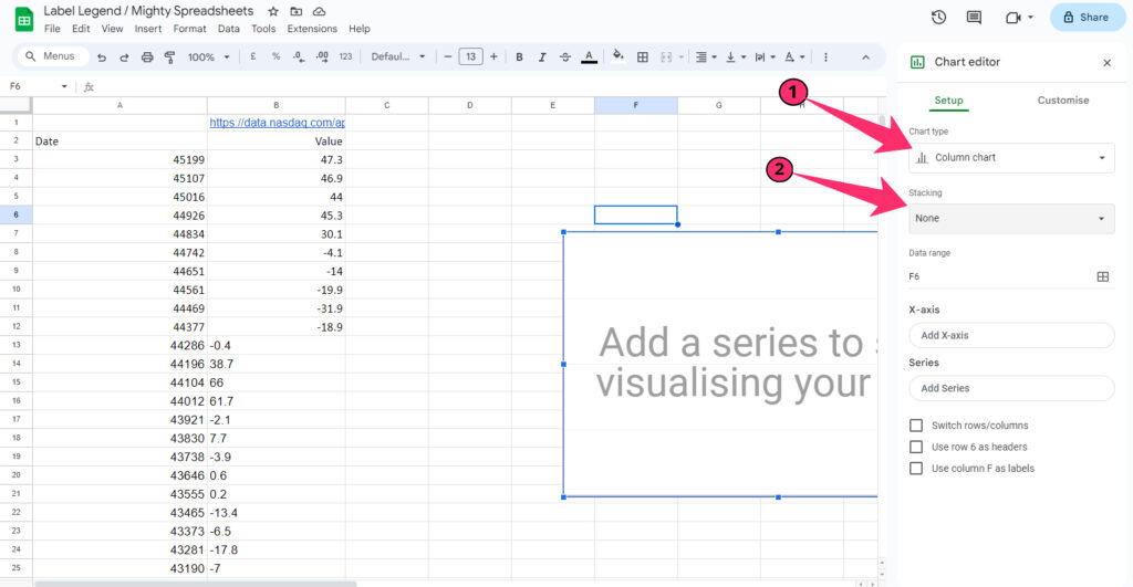
- Step 6: Click on the drop-down menu beneath the “Stacking” option and choose your preference (the default is “None”).
Note: It will be better to remove all the duplicates from your spreadsheet before you make a chart to have a clean data arrangement. And to do it efficiently, check out my latest guide on removing duplicates in Google Sheets.
How To Add A Legend To A Chart?
Once you have made the initial chart with your selected data range, you can then assign different legends to different labels or series on your chart. And you can add those from the “Chart Editor” itself.
When you create your chart, label legends also get automatically created. If not, you can also add it manually.
- Step 1: Navigate to the “Chart Editor” sidebar and click on the “Add series” option (If there is no series present).
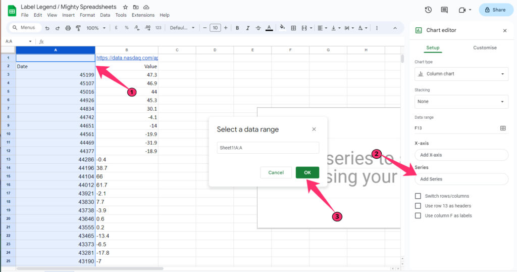
- Step 2: Select the series you want to use in your chart, and it will be automatically displayed.
- Step 3: Now, repeat the process and add all the series that you want to add.
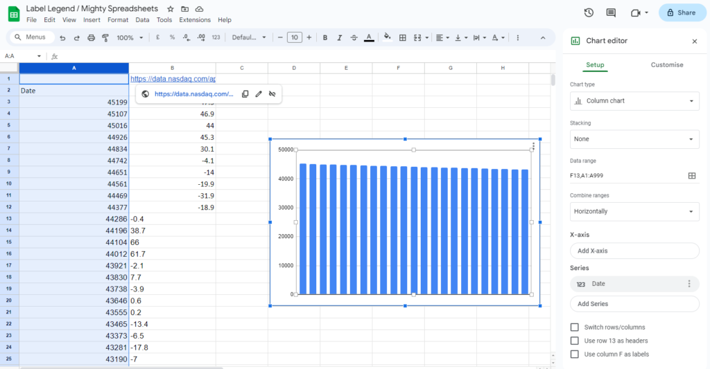
- Step 4: Make sure the checkbox is marked beside the “Use column A as labels” option.
- Step 4: You can now see legends automatically appearing in the chart with header names of the 1st row of your dataset.
- Step 5: Double-click on any legend on your chart, and it will become editable.
- Step 6: Finally, assign the name of the legends that you want to display on the chart.
You can bring the “Chart Editor” sidebar by double-clicking on your chart. Alternatively, you can also bring it by clicking on the three vertical dots located at the top-right corner of the chart and then clicking on the “Edit The Chart” option.
How To Add Axis Labels In Google Sheets?
Besides the data of the chart, you can also add labels to both the axis of your chart. And it is necessary to assign it, as it will not be possible to understand which axis is denoting what in your chat. It is easy to add those, though!
- Step 1: Double-click on your chart on Google Sheets, and the “Chart Editor” sidebar will appear on your right.
- Step 2: Click on the “Customize” tab from the header.
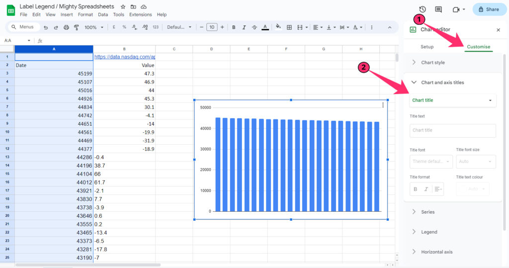
- Step 3: Now, click on the “Chart & axis titles” option.
- Step 4: Select “Horizontal axis title” from the drop-down menu for the label you want to display horizontally below the graph.
- Step 5: Enter the label name in the “Title text.”
- Step 6: Customize the font, size, color, and alignment of the label depending on your preference.
- Step 7: Once done, navigate to the first drop-down menu and select the “Vertical axis title” for the label you want vertically on the left side of the graph.
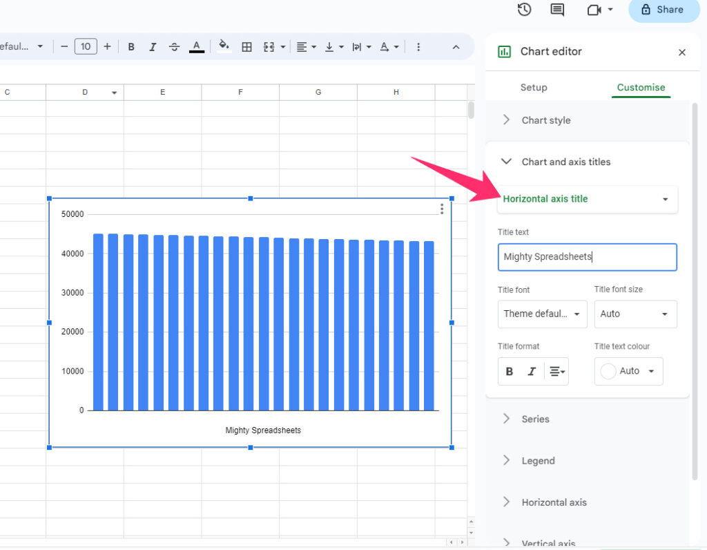
You can also add a second vertical (Y) axis label to your chart, which is extremely useful for complex data visualization. And it is also very easy to add.
- Step 1: Launch “Chart Editor” and click on the “Customize” tab.
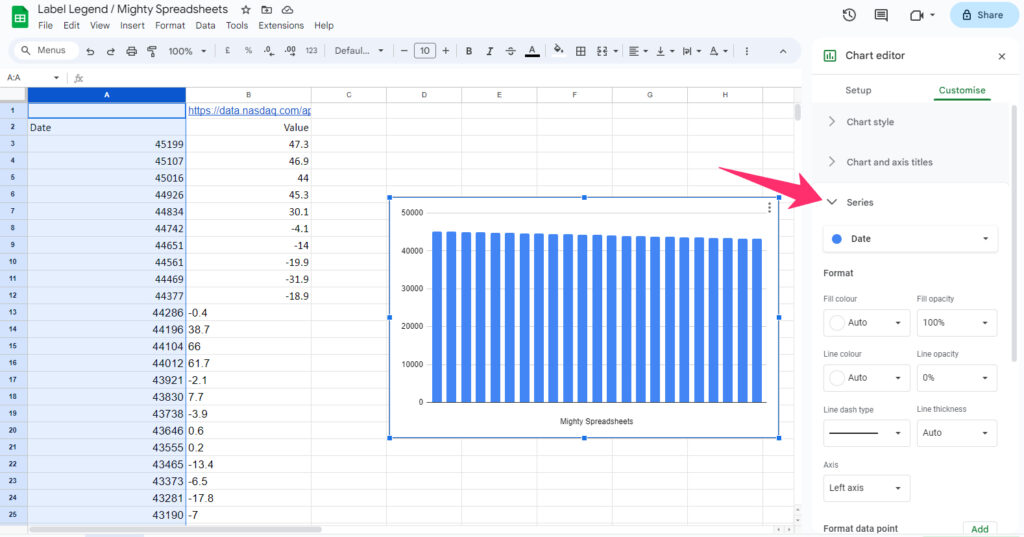
- Step 2: Click on “Series” and select the label you want to display on the second vertical axis.
- Step 3: Select the customization option depending on your preference.
- Step 4: Click on the drop-down menu below the “Axis” option and select “Right Axis” (to display it on the right side of the graph).
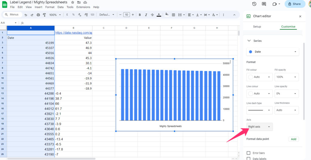
- Step 5: Now, go back to the “Chart and axis titles” option under the “Customize” tab.
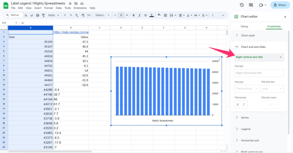
- Step 6: Select the “Right vertical axis title” from the drop-down menu.
- Step 8: Enter the name of the label in the “Title text” box, and it will start appearing on the right side of your graph.
Bonus: By using the Date function in Google Sheets, you can make real-time data points on your spreadsheet. And to do it easily, follow my newest guide on the date function in Google Sheets.
Different Customization Options Available For The Legend
Once you fully understand how to label legends in Google Sheets, you need to start getting familiar with the customization option available. And there are different options available that you can access from the same “Chart editor” sidebar.
- Step 1: Double-click on your chart to bring the “Chart editor” sidebar on your spreadsheet.
- Step 2: Select the “Customize” option from the header tabs.
- Step 3: Click on the “Legends” option.
- Step 4: Select where you want to display the legends from the drop-down menu below the “Position” option.
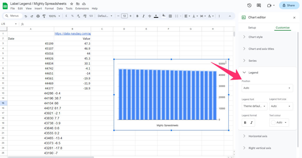
- Step 5: Choose the font of the legends from the drop-down menu below the “Legend font” option.
- Step 6: Choose your preferences from the drop-down menus below the “Legend font size,” “Legend format,” and “Text color” options.
Do remember that customizing these will only change the labels of the legends. It will not change the labels of your axis (vertical and horizontal).
Add Legend Using Google Sheets Mobile App (Android & iOS)
The Google Sheets available on both Apple App Store and Google Play Store is a great tool that empowers you to work with complex data in a spreadsheet on the go. And it is also easy to label legends in Google Sheets app.
- Step 1: Launch the “Google Sheets” app on your smartphone and open your spreadsheet.
- Step 2: Tap on the first cell of the data range to select it.
- Step 3: Now, tap and hold the blue dot on the bottom-right corner of the cell.
- Step 4: Drag the blue dot diagonally to select the entire data range (Alternatively, you can directly enter the data range in the name box).
- Step 5: Tap the “+” sign in the top-right corner.
- Step 6: Tap on the “Chart” option and select the chart type from the drop-down menu.
- Step 7: Once you have created the chart, you can label legends the same way you do it on the desktop version.
Note: You must filter data of a complex data range to make a concise format. And it will also be easier for you to make the chart from the concise data. Follow my latest guide on filtering data in Google Sheets to know more!
How To Edit The Legend In Google Sheets?
Not just adding the legends to a chart, Google Sheets offers you complete editing options as well. And you can add titles, change the font, and add text colors in your legends to make them visually aesthetic. Let’s see how we can easily edit those!
How To Add Text To Legend In Google Sheets?
When you create a chart on Google Sheets, it automatically assigns a legend depending on the parameter of the first row (by default). However, you can change the text (title) of any particular legend quite easily.
- Step 1: Navigate to the legend where you want to add text to your chart.
- Step 2: Double-click on it, and the “Text formatting” sidebar will appear on the right side.
- Step 3: Add the text that you want to use as the title of the legend in the “Text label” field.
If you have multiple legends in your chart, you can edit those by double-clicking on each legend (where the default name is automatically assigned). And you can customize each of those legends differently.
How To Name Legend In Google Sheets?
Adding text to a legend and naming it is the same thing, as you can only add titles of the legends. However, if you don’t have any legend appearing by default on your chart, there is a workaround.
- Step 1: Navigate to the colored boxes (without texts) in your chart on Google Sheets.
- Step 2: Double-click on the first colored box, and an editable text box will appear.
- Step 3: Enter the name of the legend in the text field and hit enter.
- Step 4: Repeat the same process for every colored box.
Please note that it may be difficult to find the legend field if it does not appear on the chart. Hover your cursor slowly over the blank field of the chart, and an empty box should appear. Click on it to edit the legend or to insert a new one.
How To Edit Legend Names In Google Sheets?
If you want to add any desired name to any legend, you can simply double-click on the legend and edit the title text. However, if you want to change the whole legend altogether, there is no way to do it from the “Chart editor” sidebar. But there is a way to do it.
- Step 1: Double-click on the first column header (that assigns the first legend) to make it editable.
- Step 2: Change the name of the header.
- Step 3: Repeat the process for every header that you want to assign a legend.
- Step 4: Once you complete editing the header titles, it will automatically reflect the matching legends in your chart.
Bonus: Do you know that you can now make a header for the rows in your spreadsheet? Check out my detailed guide on adding a header row in Google Sheets.
How To Change The Color & Size Of Legend Labels?
Not just the title (name) of the legends, you can now also customize and adapt different styles on legends in your chart. Google Sheets gives you the option to change font, size, color, and other customization options.
- Step 1: Double-click on the blank space on your chart on Google Sheets, and the “Chart editor” sidebar will appear on the right.
- Step 2: Click on the “Customize” option from the header tabs.
- Step 3: Scroll down and click on the “Legend” option.
- Step 4: Click on the drop-down menu below the “Legend font” option and choose your preferred font.’
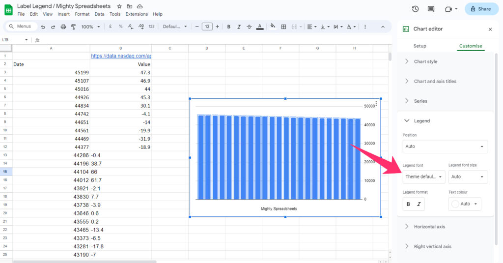
- Step 5: Now, choose the size of the font from the drop-down menu below the “Legend font size” option.
- Step 6: Choose your preferred color of the legend from the drop-down menu beneath the “Text color” option.
Besides these, you can also make your legends in “Bold” and “Italics” to decorate them. And you can do it from the same customize option.
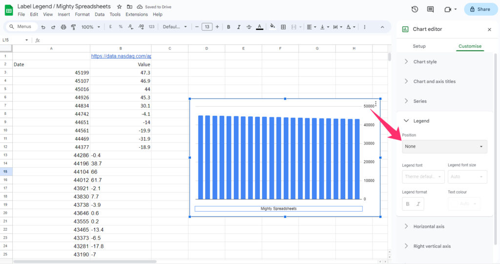
How To Change The Position Of The Legend?
By default, legends automatically appear right above the graph inside your chart. But you can change the position where you want the legends to appear. Steps are easy, though!
- Step 1: Double-click on the empty space of your chart to bring the “Chart editor” sidebar.
- Step 2: Select the “Customize” tab from the header selection menu of the sidebar.
- Step 3: Click on the “legend” option to expand it.
- Step 4: Click on the drop-down menu beneath the “Position” option.
- Step 5: Select the preferred position, and the legends will shift accordingly.
Not just top, bottom, left, and right, you can also position your legends inside the graph itself. If you choose this option from the drop-down menu, legends will start to appear between the topmost gridlines.
Formatting The Legend
If you select the “Use row 1 as headers” and “Use column A as labels” options, the matched legends will automatically appear once you create a chart. However, you can also assign different headers as well.
And once you edit and change the name of the row and column header on the main spreadsheet on Google Sheets, the legend names on the chart will automatically match.
You can also assign new colors to the icons of the legends (not the text) by editing the “Series” of your chart. Follow these steps to assign a new color.
- Step 1: Double-click on the empty space on your chart to launch the “Chart editor” sidebar.
- Step 2: Click on the “Customize” tab from the header menu.
- Step 3: Scroll down and click on “Series.”
- Step 4: Select the associated series of the legend you want to assign a new color from the drop-down menu.
- Step 5: Click on the drop-down menu below the “Fill color” option, and a color palette will appear.
- Step 6: Choose your preferred color, and the small box beside the associated legends will automatically match the chart.
Note: If you assign a new color to a series, the graph that represents that particular series will also change its color. And there is no way to assign different colors to the same series and associated legend icon.
Tips For Effective Legend Labeling
Once you know how to label legends in Google Sheets, you need to then work on how to effectively use this feature to get a cleaner and sleeker visual representation of your data.
First, you need to make your series clear and concise to get a correct visual representation on the chart. You also need to refrain from assigning lengthy titles to the legends.
Secondly, you need to place the legends in such a position that it does not create any visual obstruction on the chart. In my opinion, it is better not to use the “Inside” position to display your legends.
At times, you may not find the legends on your chart for some reason. But there is an effective way to make them reappear.
- Step 1: Double-click on the empty space on your chart.
- Step 2: Navigate to the “Chart Editor” sidebar on the right side of your spreadsheet.
- Step 3: Click on the “Customize” option from the header tabs.
- Step 4: Scroll down and click on the “Legend” option.
- Step 5: Make sure the “None” option is not selected in the drop-down menu beneath the “Position” header.
If it doesn’t solve your problem and the legends are still missing from the chart, you can just restart your Google Sheets. In most cases, this will resolve the issue. If not, then navigate to Help from the header menu. Click on Help > Send Feedback > Report an issue to submit the problem to the Google developer team.
How To Name And Label Series In Google Sheets?
Not just to label a legend in Google Sheets, you can now label different series in your chart as well. So, let’s see how we can easily do that!
How To Label Series In Google Sheets?
Series are the different sets of data that you incorporate in your chart on Google Sheets. And it is automatically assigned when you opt for the chart after selecting the whole data range. However, you can also manually do it.
- Step 1: Launch Google Sheets and open your spreadsheet.
- Step 2: Double-click on the empty space of your chart to launch the “Chart editor” sidebar.
- Step 3: On the “Setup” tab, navigate to the “Series” section.
- Step 4: Click on the “Add series” option, and a list of available series in your selected data range will be displayed.
- Step 5: Select all the series that you want to include in your chart one by one.
- Step 6: Now, click on the three vertical dot icon beside the series name.
- Step 7: Click on the “Add label” option, and a label with the same series name will be automatically assigned.
- Step 8: Repeat the process for every series where you want to place a label.
If you select the “Use row 1 as header” option on the chart editor, every cell of the first row will automatically become a series individually. But if you have selected “Use column A as labels,” you may not get the series on the first column automatically. But you can add it the way I’ve shown you above.
Bonus: Do you know that you can now even insert emojis and special characters in your spreadsheet? Don’t forget to check out my latest guide on inserting emojis and symbols in Google Sheets to know more.
How To Change Series Name In Google Sheets?
It is not possible to change the name of the series from the chart editor sidebar on Google Sheets. You can only customize the appearance of the series, such as changing the font, font size, and color.
However, if you want to change the name of any series, all you need is to change the name of the header of that respective series. Once you change the name of the series on the actual spreadsheet, it will automatically match on your chart.
FAQs
1. Why Can’t I Label My Legend In Google Sheets?
It is possibly a technical glitch that can be sorted by restarting your Google Sheets. However, it can even happen if you haven’t assigned any row or column as the headers of the chart.
In that case, you need to assign the headers and the series on your chart. Only then will the legends start displaying, which you can then label accordingly.
2. How Do I Make Sure My Legend Labels Are Clear And Concise?
Don’t use any lengthy name in the “Title box” of your assigned legend on Google Sheets. It will not just disrupt the visual aesthetics but also make it hard for the viewers to understand different labels.
You also need to make sure that you are not displaying the legends inside the graph (unless you truly require it).
3. Why Isn’t My Legend Label Showing Up In Google Sheets?
Most possibly, the “Position” of your legend label is set to “None” in the chart editor. You can rectify it by clicking on the “Customize” tab, then clicking on the “Legend” option, and then finally selecting any position from the drop-down menu beneath the “Position” header.
Final Note
It is absolutely necessary to use the right kind of a legend in any chart on Google Sheets to make it easy to understand. If you label the legends on the chart correctly, the entire visual representation of the data set becomes streamlined.
But refrain from using lengthy names while labeling legends. Try to make the chart and legends clean and concise to increase the overall aesthetics. And if you have any technical glitch while labeling it, it is better to contact the support team at Google.